There’s been a quiet revolution in conference presentations over the past ten years, and it’s all in the name of learning and knowledge translation. Gone are the days of banging out a deck of slides using a canned Power Point template or one covered with an organization’s logo and a list of six bullet points per slide. Nowadays, savvy presenters are putting a more thought and innovation into their presentations in order to better engage audiences and communicate their key messages. Many millennials seem to understand this new era of communication and design intuitively, while many of us from other generations are still learning.
Don’t let your great content get lost in a lacklustre presentation! Here are three quickie tips to rock your CES2017 presentation.
1. Update Your Slides
If you haven’t noticed, slides today are different. They use high-quality images, aim for one idea per slide, and have a maximum of six words. This doesn’t mean you have to sign up for a course in graphic design. If you follow Echo Rivera’s ten tips you’ll have them looking amazing in no time. Other great slide design resources are Presentation Zen by Garr Reynolds, Slide:ology by Nancy Duarte, and the AEA’s Potent Presentations Initiative.
2. Focus Your Talk
Have you ever been in a session where a presenter spent 80% of their time giving detailed information about the program evaluated and only 20% about the actual evaluation, simply because they ran out of time? Your audience is more interested in what methodology you used, what you learned, and how they can apply it to their own work. Practice your timing beforehand, even if you’re a seasoned presenter. If you want to be super diligent, ask someone to give you a warning sign at the ten and five-minute marks to keep you on track.
3. Speak to Engage
Avoid reading from your slides. By the time you’ve read your second bullet the audience has already read to the bottom of the screen and is starting to think about other things. This is because they can read approximately seven times faster than you can talk. If you’ve followed Tip #1, you won’t have six bullets on your slides, instead you’ll have six words.
Many of us dislike being lectured at for long periods of time, so consider engaging your audience through more interaction. Simple techniques such as asking questions, conducting audience polls, or short “pair and shares” can go a long way to keeping your audience interested and involved in your subject matter.
The New Normal
The “new normal” doesn’t mean your slides have to be super slick or your speaking has to be worthy of a TED talk. Let’s face it, we’re evaluators, not graphic designers. But if you truly believe you have something important to share, and you want the audience to understand and remember it long after the conference, you’ll want to spend that extra bit of time on your presentation.
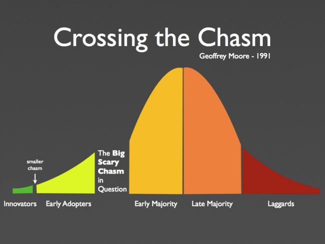
Trends in conference presentations have now advanced to the late majority, so don’t be caught as a laggard!
If you’d like to learn more, there’s a whole host of user-friendly resources on the AEA’s Potent Presentations Initiative website ranging from speaking tips to handouts. Or check out my short pamphlet on 25 Tips for Better Conference Presentations.
Kylie Hutchinson is an independent consultant with Community Solutions Planning & Evaluation and author of Survive and Thrive: Three Steps to Securing Your Program’s Sustainability.